Apple-style Liquid Glass effects in React with liquid-glass-react
Apple's Liquid Glass design language, announced at WWDC25 in June 2025, is a native UI material that bends and refracts light through translucent surfaces in real time. It ships on Apple platforms only, but the open-source liquid-glass-react library by Max Rovensky brings a close web approximation to React apps using SVG displacement maps and CSS backdrop-filter. By the end of this guide you will have a working Vite + React app with several liquid glass React components rendered and photographed, covering every major prop and each of the four refraction modes.
What is Apple Liquid Glass
Apple announced Liquid Glass on June 9, 2025 as part of the broadest software design update the company has shipped. The new material extends across iOS 26, iPadOS 26, macOS Tahoe 26, watchOS 26, and tvOS 26. Unlike the frosted materials in earlier Apple platforms that scattered light, Liquid Glass is described in the WWDC25 session as "a new digital meta-material that dynamically bends and shapes light" — the primary mechanism is called Lensing, which concentrates and shapes light in real time rather than simply blurring what lies behind.
There are two Apple variants: Regular and Clear. Regular is adaptive and works in any size over any content. Clear is permanently more transparent and requires a dimming layer when labels or symbols sit on top of it. Both variants are implemented as native SwiftUI, UIKit, and AppKit materials and cannot be directly ported to the web. The libraries in this article approximate the visual effect using SVG filters and CSS.
Install liquid-glass-react
Run the install command inside your React project:
npm install liquid-glass-react
The package requires React >=18 and react-dom >=18 as peer dependencies. The default import is:
import LiquidGlass from 'liquid-glass-react'
Watch out for similar package names. Several packages with nearly identical names exist on npm and do different things. @liquidglass/react (v0.1.3) has a completely different API that uses borderRadius, blur, contrast, and brightness props instead of the cornerRadius, blurAmount, and saturation props used by liquid-glass-react. ios26-glassmorphism-react is a physics-based alternative with its own full component set (described in the Alternatives section below). @tinymomentum/liquid-glass-react and @developer-hub/liquid-glass are separate packages with different APIs. If your import says import { LiquidGlass } from '...' rather than import LiquidGlass from '...', you have the wrong package.
Set up a Vite and React project
Scaffold a fresh project, install dependencies, and add the library:
npm create vite@latest liquid-glass-demo -- --template react
cd liquid-glass-demo
npm install
npm install liquid-glass-react
npm run dev
Before you render any glass component, you need a colourful or photographic background behind it. The effect relies on CSS backdrop-filter, which produces no visible output against a plain white or solid background. Wrap your glass components in a full-screen gradient div:
<div style={{
  minHeight: '100vh',
  background: 'linear-gradient(135deg, #667eea 0%, #764ba2 100%)',
  display: 'flex',
  alignItems: 'center',
  justifyContent: 'center'
}}>
  {/* glass components here */}
</div>
Render your first glass component
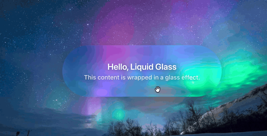
The minimal working example wraps any children inside <LiquidGlass>:
import LiquidGlass from 'liquid-glass-react'

function App() {
  return (
    <div style={{
      minHeight: '100vh',
      background: 'linear-gradient(135deg, #667eea 0%, #764ba2 100%)',
      display: 'flex',
      alignItems: 'center',
      justifyContent: 'center'
    }}>
      <LiquidGlass>
        <div style={{ padding: '24px 32px' }}>
          <h2>Hello, Liquid Glass</h2>
          <p>This content is wrapped in a glass effect.</p>
        </div>
      </LiquidGlass>
    </div>
  )
}
The defaults give you a pill-shaped frosted card: displacementScale=70, blurAmount=0.0625, cornerRadius=999 (any value larger than half the element height produces fully rounded ends), and saturation=140. Here is what that looks like rendered in Chromium:
Understand the key props
The props control the four visual layers of the effect independently. Edge distortion comes from displacementScale via an SVG feDisplacementMap filter. Frosting comes from blurAmount via CSS backdrop-filter blur. Colour enhancement comes from saturation via an SVG feColorMatrix filter. Chromatic aberration (colour fringing at edges) comes from aberrationIntensity via multi-channel SVG filtering.
Choose a refraction mode
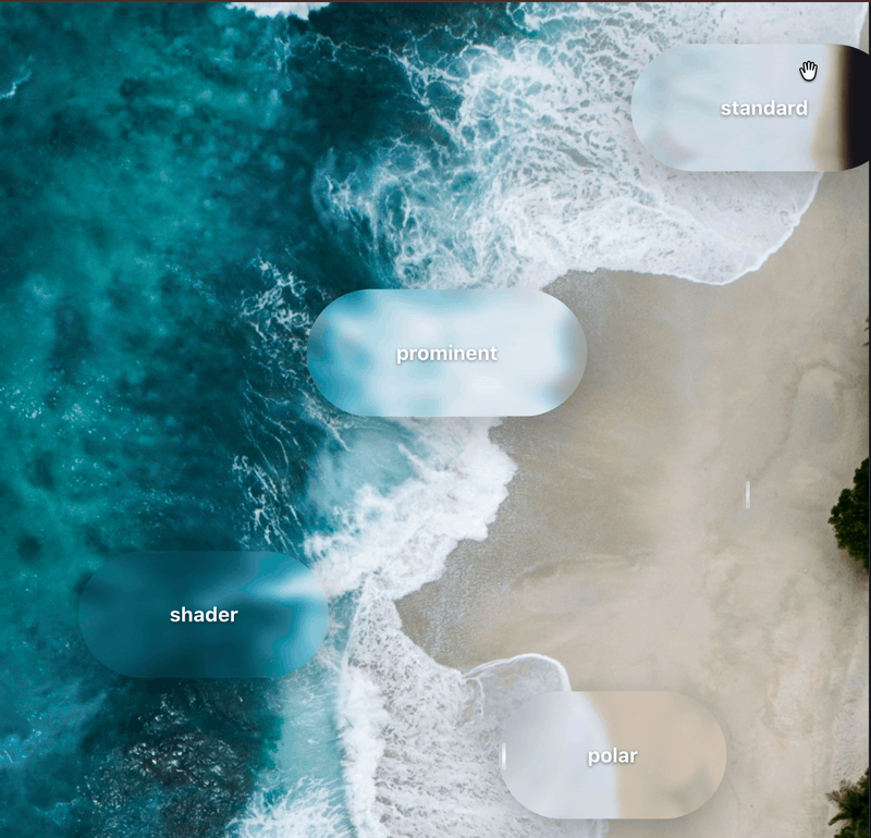
The library provides four modes, each using a different rendering approach.
Standard mode for everyday use
mode="standard" is the default. It uses a static SVG displacement map. This mode has the best performance and the most predictable output, making it a good choice for cards, panels, and navigation bars.
<LiquidGlass mode="standard">Standard</LiquidGlass>
Polar mode for radial distortion
mode="polar" applies a radial displacement pattern where edges warp outward from the centre. It works well for circular or badge-like elements.
<LiquidGlass mode="polar" cornerRadius={999}>Polar</LiquidGlass>
Prominent mode for featured elements
mode="prominent" uses feature-enhanced displacement for a stronger, more dramatic refraction effect. Use it for hero components or primary call-to-action elements where you want the glass to stand out.
<LiquidGlass mode="prominent">Prominent</LiquidGlass>
Shader mode for cross-browser support
mode="shader" generates displacement dynamically via a WebGL shader. This is the only mode that renders the full displacement effect in Safari and Firefox as well as Chrome. The README notes it is "the most accurate but not the most stable" — test it thoroughly in your target environment before shipping.
<LiquidGlass mode="shader">Shader</LiquidGlass>
Here are all four modes rendered over the same background:
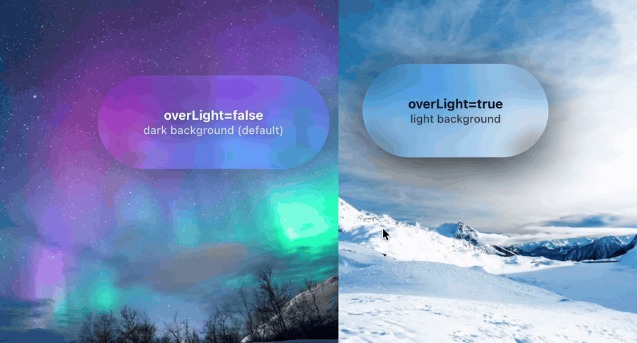
Use the overLight prop for light backgrounds
The default glass rendering is tuned for dark or colourful backgrounds. When you place a glass component over a white, light grey, or pale background, the effect washes out. Setting overLight={true} tells the component to dim its backdrop slightly rather than lighten it, keeping the glass visible against a pale surface.
{/* Over a dark background — default */}
<LiquidGlass>Dark background glass</LiquidGlass>

{/* Over a light background */}
<LiquidGlass overLight={true}>Light background glass</LiquidGlass>
Build a practical glass navigation bar
Here is a realistic UI pattern that combines mouseContainer, style for fixed positioning, and padding. When you pass a ref to mouseContainer, the glass effect tracks mouse movement anywhere in that container, not just over the component itself. This is what makes the refraction feel alive as the user moves around the page.
import { useRef } from 'react'
import LiquidGlass from 'liquid-glass-react'

function GlassNav() {
  const pageRef = useRef(null)

  return (
    <div
      ref={pageRef}
      style={{
        minHeight: '100vh',
        background: 'linear-gradient(135deg, #1a1a2e 0%, #16213e 50%, #0f3460 100%)'
      }}
    >
      <LiquidGlass
        mouseContainer={pageRef}
        displacementScale={50}
        blurAmount={0.08}
        saturation={130}
        cornerRadius={16}
        padding="12px 24px"
        style={{ position: 'fixed', top: 16, left: '50%', transform: 'translateX(-50%)' }}
      >
        <nav style={{ display: 'flex', gap: 32, color: 'white' }}>
          <span>Home</span>
          <span>Docs</span>
          <span>Blog</span>
          <span>GitHub</span>
        </nav>
      </LiquidGlass>

      <div style={{ padding: '120px 40px', color: 'white' }}>
        <h1>Page content here</h1>
      </div>
    </div>
  )
}

Use displacementScale=0 for circular buttons to avoid SVG artifacts
When cornerRadius is 999 and the element is small or square, the SVG displacement filter can produce visible distortion artifacts at the rounded edges. Setting displacementScale={0} turns off displacement entirely while keeping the frosted blur, saturation boost, and chromatic aberration, giving a clean circular glass button without edge distortion.
{/* Circular button — disable displacement to avoid edge artifacts */}
<LiquidGlass
  displacementScale={0}
  blurAmount={0.06}
  cornerRadius={999}
  padding="22px"
  onClick={() => console.log('clicked')}
>
  <span>+</span>
</LiquidGlass>
Browser compatibility
The library has two rendering paths with different browser support.
SVG displacement path (standard, polar, prominent modes)
The default modes use an SVG feDisplacementMap filter combined with CSS backdrop-filter. The displacement effect only renders in Chrome, Edge, and other Chromium-based browsers. In Safari and Firefox, backdrop-filter still applies so you get the frosted blur and saturation boost, but the edge distortion disappears.
*Firefox requires enabling layout.css.backdrop-filter.enabled in about:config.
Shader mode (WebGL path)
mode="shader" uses a WebGL shader to generate displacement dynamically. This works in all modern browsers including Safari and Firefox. The trade-off noted in the README is that shader mode is "the most accurate but not the most stable" — test it thoroughly in your target environment before shipping.
Practical fallback strategy
For broad browser support, use mode="shader" or provide a CSS-only fallback for non-Chromium visitors. The Leonxlnx implementation uses a browser-detect.ts and shimmer-overlay.tsx pattern to serve a CSS shimmer overlay as a graceful fallback for Safari and Firefox users.
Use liquid-glass-react in Next.js App Router
Because liquid-glass-react uses mouse event handlers and DOM refs for interactive tracking, it cannot run as a React Server Component. Add "use client" at the top of any file that imports LiquidGlass:
'use client'

import LiquidGlass from 'liquid-glass-react'

export function GlassCard({ children }: { children: React.ReactNode }) {
  return <LiquidGlass>{children}</LiquidGlass>
}
Wrapping LiquidGlass in a thin Client Component like GlassCard lets you use it from Server Components without marking whole page files as "use client".
Alternatives to liquid-glass-react
liquid-glass-react is the right choice when you want the simplest API and are targeting Chromium. ios26-glassmorphism-react v2.0.0 is worth considering when you need broader browser support (it claims full support in Chrome 76+, Safari 14+, Firefox 103+, and Edge 79+), or when you want a purpose-built component set including GlassButton, GlassModal, GlassNavigation, and GlassInput. Avoid @liquidglass/react for production use. At v0.1.3 the API differs from the better-known alternatives and the package is early-stage.
Conclusion
You installed liquid-glass-react, rendered a basic glass card with default props, worked through all four refraction modes and the overLight prop, built a practical fixed navigation bar with mouseContainer, and noted the SVG-path browser limitation and the shader workaround. The live demo is at liquid-glass.maxrovensky.com and the full source is at github.com/rdev/liquid-glass-react.